Global Warming – Since When, and Says Who?
By David Morgan
Gravity: it’s the law. Having built a house or two and having been around many who did, I have heard many times how important it is to construct a really good, strong foundation. It’s absolutely crucial. I am sure many of you have heard the same. If you don’t, the house won’t stay standing for long. Gravity will see to that.
But I never heard anyone mentioning to me that there was a scientific ‘consensus’ among experts for the existence of gravity, as though that is why I should pay attention. The existence of gravity wasn’t just an opinion; it was a scientific fact. Gravity is the law. People are entitled to their own opinions, but not to their own facts.
Struck by today’s media and the Oscar blitz of just how dangerous climate warming is, I became fascinated by the fervor with which the media and senior officials clung to the statement that ‘global warming’ obviously was the truth because there was a ‘consensus’ among scientists. However, science does not arrive at conclusions based on ‘consensus’ but rather derives its outcomes based on a proven methodology of the study of facts. ‘Consensus’ is simply a political and a sociological tool, not a scientific one.
Even though I am not a scientist, I nevertheless decided to
take a hard look at the foundations of this ‘science’ of global warming as best
I could, but first I needed to put down exactly what was being stated as the
‘consensus.’ When I did, I found that the argument went like this:
- The entire world is getting warmer and is doing so at an accelerating rate. This entire process has accelerated in the past hundred to two hundred years. Global temperatures have risen an average of .7 to 1.4 degrees F over the past century.
- Humans and their activities are playing the major role in its doing so, primarily by creating the ‘pollutant’ carbon dioxide. Methane is also mentioned from time to time. Most of these effects are attributable to the exponentially increasing levels of greenhouse gases in the atmosphere. During the past two to three hundred years, atmospheric carbon dioxide (CO2) and methane have increased by about 36%.
- Furthermore, sea levels have risen four to eight inches since the beginning of the industrial revolution. Since the 1970’s there has been a 10% to 15% decrease in the Artic sea ice area, ice has become less thick, and there have been significant decreases in the Earth’s snow cover.
- The prognosis is glum. If greenhouse gas levels keep rising at these rates, atmospheric CO2 will double by the year 2100. This will result in global temperature increases of 2.5 degrees up to 10 degrees F. Sea levels will increase anywhere from 4 inches up to nearly 3 feet.
Certainly sounds terrifying to me. What really stuck me was how it was possible to figure all this out in just 20 to 25 years. In April of 1975 Newsweek and many experts warned us that we were in a dire position because global cooling was upon us. (http://sweetness-light.com/archive/newsweeks-1975-article-about-the-coming-ice-age).
A catastrophic drop in food supplies could begin in only ten years. The world was about to be facing certain starvation. Other experts suggested we needed to melt the ice caps. Twenty-five years later, it seemed incredible that they could suddenly figure out so quickly that it was now global warming that was going to destroy us. Anyhow, I wanted to look at the data – at the best data I could find – to try to see for myself how they had quickly come to this new conclusion. These guys must be good.
I was also interested primarily in focusing on the raw, observed data and not on the data that comes primarily from hypothetical models based on computational smoothing, averages with gap filling assumptions and algorithms, and/or estimated regression scenarios. In addition I was interested in finding out just how the data was gathered and how it was measured and who put all this together. It’s a large globe to cover.
What kind of ‘consensus’ is there?
One of the first things I tried to discover was whether there was a ‘consensus’ for these views. It seemed like a logical thing to do. The more I looked, the more it appeared that such a ‘consensus’ did not in fact exist
First, without too much difficulty, I found that
some 20,000 people had signed a petition saying they disagreed with the
findings being advocated. “In 1997, Dr.
Frederick Seitz, past president of the
I also found that in April 2006, 60 scientists
from around the globe had sent an open letter to Canadian Prime Minister
Harper disputing the findings of the global warming theorists (http://www.canada.com/nationalpost/financialpost/story.html?id=3711460e-bd5a-475d-a6be-4db87559d605).
These were scientists from Canada, the United Kingdom, New Zealand, Norway,
Australia, the U.S., Sweden, Poland and elsewhere.
Scientists in June 2006 threw
additional cold water on the global warming theories (http://www.canadafreepress.com/2006/harris060406.htm).
Among those speaking out were climatologist
Dr.Tim Ball. "Over the past ten years the public have been
hoodwinked into thinking our emissions of carbon dioxide (CO2) are leading to a
climate catastrophe," Ball said at the Westin. "In reality,
CO2 is essential for photosynthesis and its rise and fall has never been
closely correlated with the warming and cooling of the planet."
“Two days earlier, Carleton
University Earth Sciences Professor Tim Patterson gave a comparable message
in a CBC TV news special report. ‘People in our group feel that the science has
progressed now … we now feel that climate is driven by changes in the Sun,’
said Patterson. As he testified before the House of Commons Committee on
Environment and Sustainable Development last year, Patterson told the CBC, ‘We
think that by going after CO2, which is basically plant food, and which, if we
look at the longer geologic record, there is no correspondence between CO2 and
the temperature record, that we’re wasting our money.’”
“Patterson puts the cost of Kyoto
into perspective, ‘Five million people a year die in Africa because they do not
have clean drinking water resources. The money allocated towards Kyoto in
one year would provide clean drinking water to Africa in perpetuity.’”
The week before ex-Environment
Canada Research Scientist Dr. Madhav Khandekar completely dismantled the
notion that the recent rise in CO2, the greenhouse gas most restricted by
Kyoto, is the major cause of warming at the Earth’s surface. “Instead,
Khandekar concluded in his lecture Global Warming Science: A Need for
Reassessment, land use change due to urbanization and variations in the
Sun’s brightness, both phenomena the effects of which he believes the UN’s
Intergovernmental Panel on Climate Change have not fully taken into account,
are the primary drivers of the past century’s modest warming.”
Here are a few more views: (http://www.canadafreepress.com/2006/harris061206.htm)
“Dr. Boris Winterhalter, former
marine researcher at the Geological Survey of Finland and professor in marine
geology, University of Helsinki, takes apart Gore's dramatic display of
Antarctic glaciers collapsing into the sea. ‘The breaking glacier wall is a
normally occurring phenomenon which is due to the normal advance of a
glacier," says Winterhalter. ‘In Antarctica the temperature is low enough
to prohibit melting of the ice front, so if the ice is grounded, it has to
break off in beautiful ice cascades. If the water is deep enough icebergs will
form.’
“Dr. Wibjorn Karlen, emeritus
professor, Dept. of Physical Geography and Quaternary Geology, Stockholm University,
Sweden, admits, ‘Some small areas in the Antarctic Peninsula have broken up
recently, just like it has done back in time. The temperature in this part of
Antarctica has increased recently, probably because of a small change in the
position of the low pressure systems.’
“But Karlen clarifies that the 'mass
balance' of Antarctica is positive - more snow is accumulating than melting
off. As a result, Ball explains, there is an increase in the 'calving' of
icebergs as the ice dome of Antarctica is growing and flowing to the oceans.
When Greenland and Antarctica are assessed together, ‘their mass balance is
considered to possibly increase the sea level by 0.03 mm/year - not much of an
effect,’ KarlÈn concludes.
“Dr. Dick Morgan, former advisor
to the World Meteorological Organization and climatology researcher at
University of Exeter, U.K. gives the details, ‘There has been some decrease
in ice thickness in the Canadian Arctic over the past 30 years but no melt
down. The Canadian Ice Service records show that from 1971-1981 there was
average, to above average, ice thickness. From 1981-1982 there was a sharp
decrease of 15% but there was a quick recovery to average, to slightly above
average, values from 1983-1995. A sharp drop of 30% occurred again 1996-1998
and since then there has been a steady increase to reach near normal conditions
since 2001.’
In November 2006, more experts
disputed a large number of the global warming claims being advocated (http://www.canadafreepress.com/2006/harris110706a.htm).
Some of their specific remarks were:
Dr. Chris de Freitas, climate
scientist, associate professor, University of Auckland, New Zealand: ”I can assure Mr. Gore that no one from the
South Pacific islands have fled to New Zealand because of rising seas. In fact,
if Gore consults the data, he will see it shows sea level falling in some parts
of the Pacific.”
Dr. Nils-Axel Mörner, emeritus
professor of paleogeophysics & geodynamics, Stockholm University, Sweden: “We
find no alarming sea level rise going on, in the Maldives, Tovalu, Venice, the
Persian Gulf and even satellite altimetry if applied properly.”
Dr. Petr Chylek, adjunct
professor, Dept. of Physics and Atmospheric Science, Dalhousie University, Halifax, Nova
Scotia, Canada: “Mr. Gore suggests that Greenland melt area increased
considerably between 1992 and 2005. But 1992 was exceptionally cold in
Greenland and the melt area of ice sheet was exceptionally low due to the
cooling caused by volcanic dust emitted from Mt. Pinatubo. If, instead of
1992, Gore had chosen for comparison the year 1991, one in which the melt area
was 1% higher than in 2005, he would have to conclude that the ice sheet melt
area is shrinking and that perhaps a new ice age is just around the corner.”
Dr. Gary D. Sharp, Center for
Climate/Ocean Resources Study,
Salinas, California: “The oceans are now heading into one of their
periodic phases of cooling. … Modest changes in temperature are not about
to wipe them [coral] out. Neither will increased carbon dioxide, which is a
fundamental chemical building block that allows coral reefs to exist at all.”
Dr. R. M. Carter, professor,
Marine Geophysical Laboratory,
James Cook University, Townsville, Australia: “Both the Antarctic and
Greenland ice caps are thickening. The temperature at the South Pole has
declined by more than 1 degree C since 1950. And the area of sea-ice around the
continent has increased over the last 20 years.”
Another short sample of high-caliber
scientists who are highly critical of the global warming findings is also
listed in sidebar (A), which includes a link to the names of 19,000
scientists listed by state who are critical of the global warming agenda (www.oism.org/pproject/s33p403.htm).
Indeed, it appeared that the ‘consensus’ theory just was not the case. What’s more, I found out that scientists and others who felt it important simply to question the validity of the global warming theories were simply attacked and labeled as ‘heretics’ and Nazis. Ellen Goodman, in a February edition of The Boston Globe, went so far as to say: “I would like to say we're at a point where global warming is impossible to deny. Let's just say that global warming deniers are now on a par with Holocaust deniers, though one denies the past and the other denies the present and future.” The Governor of Oregon, Ted Kulongoski, was attempting to take the title of ‘state climatolgist’ away from George Taylor because Taylor does not tow the line that ‘global warming’ is completely accurate. This is a scary way to approach science. Try it with gravity.
Now let’s analyze the facts regarding the first proposition favoring
global warming.
- The
entire world is getting warmer and is doing so at an accelerating rate.
This entire process has accelerated in the past hundred to two hundred
years. Global temperatures have risen an average of .7 to 1.4 degrees F
over the past century.
If I asked you to take a thermometer and measure the temperature of some water in a pot in your kitchen, you could probably do it fairly easily. The temperature you measured might not be perfect, but it would be pretty close, depending on the instrument you used. Looking at an ordinary household thermometer, you can see that a degree Fahrenheit is a very small amount. Half a degree is a lot less; you can hardly see it at all. Now if I asked you to measure the temperature outside your home, you could do that also, with perhaps a little more effort, particularly if it was freezing cold and raining. Moreover, if I asked you to measure the temperature of your town for a few days, that gets a little more complicated. You might ask, “where in the town?” Or even ask ‘when’ – night, day, summer, winter, morning, evening – or ‘where’ - in the sun light, under a shady spot, in an enclosed area, downtown or on the outskirts.
A lot of other questions also begin to pop up. Do I want the highest temperatures, the lowest temperatures, or some sort of average? If I want an average, how do I want it to be calculated? Not least among my questions would be who is going to do it and what do they use to do it with?
Now let’s suppose I asked you to measure the temperature of your state, and then of the USA, and then of Europe and then finally I asked you, “What is the temperature of the world?” And I wanted you to give me an answer to within one tenth (.1) of a degree.
You would probably think I was nuts.
Now, let’s augment the question by saying that I didn’t want it for just one moment in time, but I wanted it over a long period of time before you were born, and I wanted to know if it changed from time to time and, if so, why did it?
Now I am really nuts. Right?
The heart of the
debate
Well, this is exactly what we are dealing with here. The heart of the
global warming debate is that some scientists think that the entire earth has
warmed by one half-degree over the last 100 years.
The problem is that the earth is very large and
the temperature is always changing. How can we possibly tell if overall it is a
mere half-degree warmer today than it was around 1900?
The heart of the theory of global warming – it
really is just a theory - lies in taking the thermometer readings we have
obtained over the past 100 years and statistically manipulating them in various
ways. Some places have warmed up a little and other places have clearly cooled.
Many areas have just gone up and down with no real trend. To obtain a ‘global’ outcome requires a good
bit of massaging of the data and herein lies the rub.
There are several methods by which our experts try to do this. First there exist thousands of ground measuring stations that measure the temperatures at their location.
However, most of these thermometers do not really represent the total surface of the earth and certainly not its atmosphere. They were simply put out over time where people were interested in knowing about the weather, usually in proximity to population centers. They were put out in convenient locations. Oceans, mountain regions, the poles, South American jungles, deserts, and hard to reach areas were not extensively covered.
Urban heat
island effect
In addition, a large number of these measuring stations have been impacted over time by several factors that have influenced their readings. (1) One of the major changing influences is what is now called the “urban heat island” effect. That is to say, many of these locations that were located on the outskirts of towns and cities have per se gotten warmer as the populations have surrounded them. Many are now at airports where the heat and exhausts from the airplanes or the runway itself will naturally warm up the readings. This is not of little significance, especially when experts are attempting to compute readings to tenth of degrees.
Moreover, according to Dr. Vincent Gray, “Early thermometers were unreliable and difficult to calibrate. Liquid-in-glass thermometers required a capillary tube of uniform diameter and a clearly divided scale. Glass is a cooled liquid which slowly contracts over time. Liquid-in glass thermometers therefore read high if they are not frequently calibrated. This is true even of modern thermometers with improved glass.
“The
earlier measurements, up to 1900 or so, would have been made on thermometers
calibrated in single degrees, usually Farenheit, made from ordinary glass The
early measurements were made mainly near large towns in the Northern
Hemisphere. Even today, measurements are not available for many regions of the
earth’s surface, particularly those remote from cities and buildings (http://www.john-daly.com/tar-2000/ch-3.htm).” It is quite feasible that what human
development in these areas has done is not to warm up the planet, but just to
warm up a number of the thermometers. Moreover, the urban effect is more predominant in the latter part of the record
and is growing exponentially thus skewing the warming results upwards.
“The evidence is overwhelming that temperature records from places
remote from human habitation show no evidence of warming. These remote places
include forests, ice cores and other proxy measurements, measurements by
weather balloons, measurements by satellite (the only truly global
measurements) and
surface measurements in places where human influence is minimal. It only
remains, therefore to characterise the human influence around weather stations
in more detail.
A typical
measuring station
“Figure 21 shows the equipment currently used for the measurement of
surface temperature in many weather stations world wide. It shows the Stevenson
screen, a device invented by Robert Stevenson, the Scottish lighthouse engineer
and father of the author Robert Louis, in the early 1800s, and has been little
changed since. It consists of a wooden box with louvred sides and ventilated
roof , painted white, with a front lowering door.
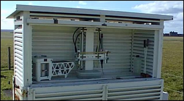
Figure
21 Surface temperature measuring equipment in current use at the
Isle of Man airport, in a Stevenson screen
“Temperatures are measured, in this case, by mercury-in-glass
thermometers.. Heat transfer to the thermometer takes place by the conventional
three mechanisms, conduction, convection and radiation. The conductivity of air
is low, so transfer by conduction will be small provided there is air
circulation within the screen. However, there will be calm days when the air
temperature within the screen, rather than that outside, has an important
influence. With good ventilation, convection exchanges heat with the
thermometers.
“The air entering the box, will however, not necessarily be
representative of the outside background climate. If it comes over mountains,
open fields or the ocean it might approximate to that background. If it comes
from a large urban area it will have exchanged heat with the buildings and
other heated surfaces. At an airport it will have been in contact with large
aircraft. The effect of “heat islands” and “urbanisation” on weather station
readings has long been recognised and many studies have attempted to account
for it by comparing measurements in “urban” and “rural” stations, defined
rather crudely by differences in population.
“Also there is no recognition of the fact that even so-called “rural”
sites, defined, sometimes, as below 10,000 population, are also subject to
local convective heating of incoming air. Airports, usually classified as
“rural” are often heat islands.
“The air entering the Stevenson screen will have a component that has exchanged
heat with local building surfaces, ground surfaces, roads, vehicles and
aircraft. The example in Figure 21 appears to have an open field behind it, but
the circulating air will undergo a sudden temperature rise every time an
aircraft is near.
“Besides convection, the thermometer exchanges heat by radiation. The
caption to this picture from the Internet stated that the white paint on the
screen prevents heating effects from the sun’s radiation. This is not true.
White paint absorbs between 30 and 50% of the sun’s radiation. The screen will
become hot in the sun, and on a calm day, without the ventilation in the roof
space, it will dominate the temperature inside. Any deterioration in the paint,
such as a loss of gloss or accumulation of dust, will increase the temperature
of the screen in the daytime without influencing radiation emission at night.
“White paint emits 95% of infra red radiation, so the temperature of the
box will be conveyed to the thermometer from the internal surfaces. On a calm
day this will be the main influence. The sun’s radiation will also heat local
buildings and roads, particularly those that are dark in colour, and this heat
will supply radiated heat to the screen and continue to do so, and affect
convected air, when the sun has gone. All surfaces will cool by radiation
overnight, again depending on their infra red emissivity, which for most
surfaces, including those painted white, is 95%.” (http://www.john-daly.com/cause/cause.htm)
Other sources of
error
Other
potential sources of error, in brief, are: “(2) long-term degradation of the
shelter housing the temperature-measuring equipment, such as its white paint
becoming less reflective and its louvers partially obstructed, (3) changes in
what is actually being measured, such as true daily maximum and minimum
temperatures or temperatures at specified times of day, (4) changes in
measurement devices and ways of accessing the data, such as changing from
having to open the shelter door to read the temperature, as was done in earlier
days, to not having to do so due to the automatic recording of the data, as has
become typical in more recent times, (5) general station degradation and many
station closures over time, (6) changing and uneven geographical representation
in the surface temperature network, (7) poor attention to careful acquisition
of data in many parts of the world, and (8) a number of problems associated
with obtaining a correct and geographically complete record of surface air
temperature over the 70% of the globe that is covered by oceans” (http://www.co2science.org/scripts/CO2ScienceB2C/articles/V3/N12/EDIT.jsp).
Use of satellites
We now do have another way to check these measurements and to help measure
the overall temperature of the earth’s atmosphere: satellites.
“This data set comes from the U.S.
Historical Climatology Network, and contains, among other things, monthly averages
of mean near-surface air temperature for 1,221 high-quality largely non-urban
stations within the 48 contiguous states of the United States of America…the
surface and satellite records for this portion of the globe were nearly
identical, and each showed no statistically significant trend…
Satellites show
no warming
“…although various climate models
differ substantially in their predictions of greenhouse warming around the
globe, they all agree on one thing: the warming, if it occurs at all, should be
accentuated in earth's higher latitudes. Hence, the planet's polar
regions should be prime candidates for displaying the postulated warming.
But when high-quality scientifically-supervised temperature records from these
regions of the earth - both north and south - are checked, they too show no
warming.
“Finally, we have the radiosonde or
weather balloon record of temperature in the same part of the atmosphere that
is monitored by satellite… its temperature history of the past two decades
closely mirrors that of the satellite record, and that it once again shows no
warming” (http://www.co2science.org/scripts/CO2ScienceB2C/articles/V3/N12/EDIT.jsp).
Raw data sites
Now, for those of you who are
interested, the following website will show you the observable data from a set
of historical temperature graphs from a large selection of mostly non-urban
weather stations in both hemispheres. Hundreds of stations from all
around the globe are available for you to look at the raw data. Take a look for
yourself to see what the stations tell us. (http://www.john-daly.com/stations/stations.htm).
Out of all this data with all the
endless possibilities for various conclusions, the general belief is that
average ground station readings have shown a mild warming of “.6 degrees C + or
- .2 degrees C over the last 140 years” (http://www.fcpp.org/pdf/The_Cause_of_Global_Warming_Policy_Series_7.pdf),
which may not even exist due the numerous problems with the readings listed
above. The satellite, balloon and mountain top readings made over the past 30
years have shown practically no long-term rate of increase in global
temperatures. Neither have a great many of the stations who have been
unaffected by the growing ‘urban heat island’ phenomenon. Certainly, no
catastrophic global warming has been recorded.
Computer
modeling changes the data
Unless, of course, all this data is
miraculously skewed by modeling to show that there has been a sudden upturn in
warming in the past few hundred years. And this is exactly what was done in the
IPCC report that stood science on its head. The Mann “Hockey Stick” graph was
created. “Global warming” in the past decade was shown to be evidenced by the
sharp upturn shown in the end of the ‘stick.’
Figures don’t
lie, but…
We all know the saying, “Figures
don’t lie, but liars sure can figure.” Keep this in mind as we take a look at
this.
Strong changes in the earth’s
climate have continuously occurred throughout geologic time. We experienced a
Medieval Warm Period from around 1000 to 1300 AD when the Vikings were able to
farm on Greenland (not such a bad thing) and the planet was considerably warmer
than today. Actually it dwarfs the 20th century changes. Christopher
Monckton in an article in the UK Sunday Telegraph said, “There was little ice
at the North Pole; a Chinese naval squadron sailed right round the Artic in
1421 and found none. The Antarctic, which holds 90 percent of the world’s ice
and nearly all its 160,000 glaciers, has cooled and gained ice-mass in the past
30 years, reversing a 6,000-year melting trend. Data from 6,000 boreholes
worldwide show global temperature were higher in the Middle Ages than now.
After that the globe entered a
period known as the Little Ice Age in which temperatures plummeted and
Greenland was no longer green. It was a tough time for folks. But since the mid
1600’s the ‘average global temperature’ (whatever that actually is – although I
am sure that people in Greenland had a good idea) has been rising at the low,
steady rate mentioned previously. It appears to be simply a recovery from the
Little Ice Age. (However, from the early 1940’s thru the early 1970’s the
temperature seemed to drop, which gave rise to the global cooling fears we
talked about earlier.)
However, if you needed to show that
there was a global warming crisis at the present time, this sort of data just
wouldn’t do. After all, the report that came out by the UN’s Intergovernmental Panel on Climate Change
(IPCC) in 2001 claimed it is likely “that the 1990’s has been the warmest
decade and 1998 the warmest year of the millennium” for the Northern
Hemisphere. That’s some claim. Where did it come from?
The manmade Mann
‘Hockey Stick’
It came from the Mann “Hockey Stick”
graph that the IPCC authors latched on to.
Basically, what happened was this.
In the report issued by the IPCC there was a graph of the average tropospheric
temperatures developed by Christie and Spencer that relied primarily on weather
satellites. It showed that since 1979 “there were no significant warming rates
over mid-latitude continental regions of the Northern Hemisphere. In the upper
troposphere, no significant global trends have been detected since the early
1960’s.” (See p. 3, http://www.uoguelph.ca/~rmckitri/research/McKitrick-hockeystick.pdf).
“Since 1979, NOAA satellites have been measuring the temperature of the lower atmosphere using Microwave Sounder Units (MSUs). The method is to measure the microwave spectrum of atmospheric oxygen, a quantity dependent on temperature. It is much more accurate than all the other measures and, also in contrast to other measurements, it gives a genuine average of temperature over the entire earth’s surface. Various efforts to detect errors have not altered the figures to any important degree. The record is shown in Figure 3.12.”
The very large effect of the El Niño event in 1998 gives a spurious impression of a small upwards trend. However, this surge is attributable to this unusually large Southern Oscillation, not to an overall warming trend.
The
absence of a distinguishable change in temperature in the lower atmosphere over
a period of 21 years is a fatal blow to the `greenhouse' theory, which
postulates that any global temperature change would be primarily evident in the
lower atmosphere. If there is no
perceptible temperature change in the lower atmosphere then the greenhouse
effect cannot be held responsible for any climate change on the earth’s
surface. Changes in precipitation, hurricanes, ocean circulation and lower
temperature, alterations in the ice shelf, retreat of glaciers, decline of corals, simply
cannot be attributed to the greenhouse effect if there is no greenhouse effect
to be registered in the place it is supposed to take place, the lower
atmosphere. (http://www.john-daly.com/tar-2000/ch-3.htm).
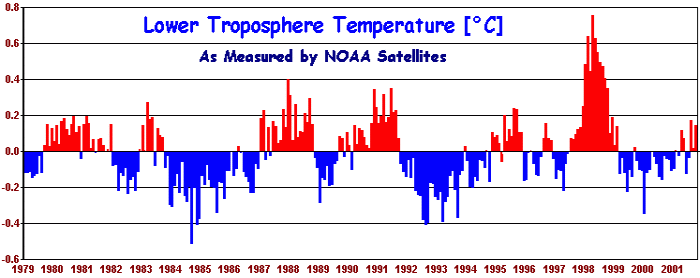
Figure 3.12 Mean global temperature anomalies of the
lower atmosphere,
as measured by MSU units (NOAA) (30)
However, this graph was downplayed and over-ridden by a deliberate editorial sleight-of hand in favor of Mann’s Hockey Stick data, which follows below.
Creating the ‘Hockey Stick’
Mann, and the IPCC, claim that Figure 3.4 proves that the weather station measurements are influenced by “anthropogenic” – human - factors, and, of course, this is probably true. But they fail to see that the “anthropogenic” effect is caused by local energy emissions, not by changes in the atmosphere. (http://www.john-daly.com/tar-2000/ch-3.htm).
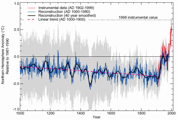
Figure 3.4. Comparison of Northern Hemisphere temperature record from proxy measurements (in blue) with weather station measurements (in red): from Mann and Bradley (12,13 ) and (14). Note the additional temperature rise from proximity of weather stations to urban areas. The gray region represents an estimated 95% confidence interval.
Let’s look at how this graph with
its ‘Hockey Stick” face was magically created. Scientists trying to figure out
local climate histories over past centuries use various techniques, including
“proxies” and “ground borehole” temperature data. “Proxies” include a wide
range of measurements that are, hopefully, sensitive to local temperature
trends, such as tree ring widths. Sometimes this is the case, and sometimes it
isn’t.
Ross McKitrick, in his article “What
is the Hockey Stick Debate About?” (http://www.uoguelph.ca/~rmckitri/research/McKitrick-hockeystick.pdf)
writes, “In the mid-1990’s the use of ground boreholes as a clue to
paleoclimate history was becoming well-established. In 1995 David Deming, a
geoscientist at the University of Oklahoma, published a study in Science
that demonstrated the technique by generating a 150-year climate history for
North America. Here, in his own words, is what happened next.
‘With the publication of the article
in Science, I gained significant credibility in the community of scientists
working on climate change. They thought I was one of them, someone who would
pervert science in the service of social and political causes. So one of them
let his guard down. A major person working the area of climate change and
global warming sent me an astonishing email that said “We have to get rid of
the Medieval Warm Period.”
Get rid of the
Medieval Warm Period
We have discussed the Medieval Warm
Period above, when the Vikings were doing their farming in Greenland. And it is
easy to see why this period created a major problem for the advocates of
‘global warming.’ If it were possible that the world could warm so much in such
a short period as a result of purely natural causes (SUV’s were not running
around much then), then surely the climate changes in the 20th century could
simply be a result of natural causes as well.
The true graph covering that period
of time looks like this:
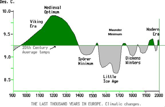
Fig.4 - Climatic Change
in Europe 900 AD to Present
Both a Viking Era Medieval Warm Period and the
Little Ice Age are well shown in the new correct graph and the 20th
Century temperature rise is seen in proper perspective to lie well
within the bounds of historic temperature. (Note: The Viking Era warm period
happens to correspond with the Medieval Optimum, which was a time of intense
solar sunspot activity. Wonder if there was any connection?)
If you compare Figure 3.4 with this Figure 4, you
will see the magic of data reshaping in order to create a crisis. The Viking
Era Medieval Warm Period went poof and was gone in Fig 3.4.
Selective
use of the start data
“Recent claims that the Earth is now
warmer than at any time in the last 600 years are actually quite true, but this
is merely a misleading statistical sleight of hand hiding the fact that global
temperature was at a historic low point 600 years ago. If we go back in
time a little further, say, to 800 years ago, we then find we are starting at
the high point of the millenium (the `Medieval
Optimum'), resulting in our period being cooler than it was
during the time of the Vikings. It's all a question of the year you choose to
start from. If you start 600 years ago during the Sporer Minimum, then there
has been a long term warming since then. But starting 800 years ago, we find a
cooling. Selective use of the start date of any data series is the oldest
statistical trick in the book. (http://www.john-daly.com/solar.htm)
Also (http://www.john-daly.com/sonde.htm)
How did this
happen? What did Mann and his buddies do?
Basically, they used very sloppy
mathematics in order to arrive at a predetermined outcome. And no one checked.
While attending a Boston business school after having received a Bachelor of
Arts degree from the University of North Carolina at Chapel Hill, I rapidly
learned how fast the boys who graduated from MIT in Boston could use a
slide-rule. (This was prior to the age of computers!) We used the case method
of study to analyze business cases, and these MIT math whizzes could take all
the facts presented and give you pretty much whatever outcome you wanted. Our real job was to try to separate the wheat
from the chaff. It was amazing stuff to
me. They were good.qqqqqqqq
In this case complex mathematical
tools were used in a rather gangster-like fashion. It is explained in full by
Ross McKitrick, in his article “What is the Hockey Stick Debate About” (http://www.uoguelph.ca/~rmckitri/research/McKitrick-hockeystick.pdf).
Briefly, “Mann et al. called their
method a ‘multiproxy’ technique, since it combined a variety of proxies. The
more numerous, and influential, proxies in their data set are tree ring
chronologies. The method required mapping a large sample of proxies to a large
sample of temperatures, and it encountered the mathematical problem that there
are more equations than there are unknowns. So the dimensions of the data
matrices had to be reduced.
“Principal components analysis is a
common tool for handling this. It involves replacing a group of series with a
weighted average of those series, where the weights are chosen so that the new
vector (called the principal component or PC) explains as much of the variance
of the original series as possible. This leaves a matrix of unexplained
residuals, but this matrix can be reduced to a PC as well. Mann et al applied
PC analysis to simplify both temperature and proxy data. For temperatures, they
represent 1,082 series with 16 PC’s. They used 112 proxies, of which 71 were
individual record and 31 were PC’s from 6 regional networks containing over 300
underlying series in total.”
Wiping out 400
years
And in the way Mann constructed his
algorithm, he simply wiped out the entire Medieval Warm Period. He gave one
technique for reconstructing pre-thermometer temperature 390 time more weight
than any other, and left out the data set showing the medieval warm period,
tucking it into a folder marked “Censored Data.”
“In the spring of 2003, Stephen McIntyre
requested the MBH98 data set from Mann,” that he had used. He was curious as to
how the graph was made “and wanted to see if the raw data looked like hockey
sticks too.” After some delay he received a file, but one of the first things
Stephens discovered was that the PC’s used in MBH98 could not be replicated.
According to McKitrick, “No one had ever replicated his (Mann’s) results, and
we know others had tried but were unsuccessful. …he also refused to supply his
computer code, a stance he maintains today.”
“In our analysis of Mann’s FTP
archive we found some remnant computer code files that turned out to be the
Fortran routines he used to compute his principal components.” Here McKitrick
found some incredible assumptions and scaling made by Mann. “In 10,000
repetitions…we found that a conventional
PC algorithm almost never yielded a hockey stick shaped PC…”
In 2005 McIntyre and McKitrick “…received an email from Dr. Hendrick Tennekes,
retired director of the Royal Meteorological Institute of the Netherlands. He
wrote to convey comments he wished communicated publicly:
‘The IPCC review process is fatally
flawed. The behavior of Michael Mann is a disgrace to the profession…The
scientific basis for the Kyoto protocol is grossly inadequate.’”
Here you have it. One of the most
important socio-political impacts in the past 10 years is based on incredibly
flimsy work.
The Hockey Stick is broken. But the
UN still uses the graph in its publications.
Let’s move on to
the second major premise of the global warming advocates:
- Humans
and their activities are playing the major role in its doing so, primarily
by creating the ‘pollutant’ carbon dioxide. Methane is also mentioned from
time to time. Most of these effects
are attributable to the exponentially increasing levels of greenhouse
gases in the atmosphere. During the past two to three hundred years,
atmospheric carbon dioxide (CO2) and methane have increased by about 36%.
Is CO2 a pollutant?
First of all, is CO2 a
pollutant? On the contrary, atmospheric
CO2 is the earth’s entire food supply, and 95% of the emissions are perfectly
natural. Watching a child grow up is simply watching processed carbon dioxide
being reprocessed. CO2 is the single most important chemical constituent of the
cycles of plant and animal life. Arthur B.
Robinson & Jane M. Orient in their article Science,
Politics and Death state emphatically, “All plant tissues are built from atmospheric CO2, and all plants and
animals produce CO2 in the fundamental respiratory processes that permit them
to exist. It has been definitively shown by many hundreds of experimental
studies that increases in atmospheric CO2 cause increases in the amounts and
the diversity of plant and animal life.
“Yes, human activity does release
CO2 into the atmosphere, but the amount, including what we exhale, must be kept
in perspective. The atmosphere contains about 750 gigatons of CO2, but the
oceans contain about 40,000 gigatons. Ordinary rises in world temperature
increase atmospheric CO2 through out-gassing from the ocean that has nothing to
do with man's industrialization. In fact, there is not a shred of experimental
evidence demonstrating human-caused global warming.”
Nitrogen forms 80% of our atmosphere.
Carbon dioxide is no more a pollutant than nitrogen is.
In addition, trying to track down
just how much carbon dioxide is emitted annually by all human activities has as
many answers as it does sources, ranging from 3 billion tons to 28 billion tons,
a minute amount compared to the 750 gigatons already there. The fact that the topic rarely comes up
suggests the lack of knowledge is widespread.
CO2
measurements, in parts per million – a tiny part of the atmosphere
Let’s look at some CO2 measurements.
Here is
a graphic summary of annual averages of the CO2 measurements at Mauna Loa since
1960, including the data added for 2003. (http://www.john-daly.com/index.htm)
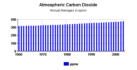
“Keeping in mind
that the unit of measure is ppmv (parts per million by volume), it is
clear that CO2 is a
very small portion of the atmosphere. Just to repeat, it is parts per million.
Among the so-called greenhouse gases, it is a very distant second to H2O.
“And yet, some
people portray CO2 as if it had almost mythical powers of dominating
climate around the
globe.
”While the atmospheric parts per million of CO2 have continually increased
during recent decades, atmospheric temperatures have risen, and fallen,
uninfluenced by any notions that some people may have about the powers of CO2.
Atmospheric temperatures respond to realities, not myths.
”As for the amount of the increase of atmospheric CO2 from 2002 to 2003, it was
approximately two and one half parts per million, 2.54/1000000.00 to be more
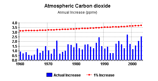
precise.” Here is a graphic summary of the annual increases since 1960:
CO2 Levels
FOLLOW temperature changes
Carbon dioxide levels have indeed
changed for a number of reasons just as they have though out the earth’s
history. One of the prime forces for change has been the sun, which has now
been relegated to the back burner. Since the beginning of the industrial
revolution, the CO2 content of the atmosphere has increased at about .2% per
year. However, there is absolutely no proof that CO2 is the main driver of
whatever global warming has occurred.
As a matter of record it is shown
quite clearly by measurements of ice cores dated over 400,000 years that CO2
levels move up or down AFTER the temperature has done so and thus is
the result of, not the cause of, any warming.
Certainly, if man-made global
warming is really going on due to the production of CO2, then it should
certainly follow that any temperature increases should be even more obvious in
the upper atmosphere. However, any increases in temperature measurements have
been detected only at surface stations; satellites have shown practically none
at all.
Sun and
sunspots could be doing it all
It is worth a moment to digress and
look at the role of our sun in the earth’s climate changes. Many of those attacking human activities for
being responsible for whatever they find happening in the way of ‘climate
change’ seem just to ignore the sun and to pretend that it doesn’t exist.
“The most remarkable event in the last 500 years was the `Maunder Minimum', a 50-year period from 1650 to 1700 when there were hardly any sunspots at all, indicating a prolonged cooler period on the Sun. Another period from 1800 to 1830 shows very reduced activity, and a further moderate period in the late 19th and early 20th century. Contrast these with the heightened level of activity and warmth in the latter half of the 20th century, the most intense since solar observations began around 1600 AD.
“It is possible to estimate global temperature back to 1600 AD based on indirect proxy measures such as tree ring widths, pollens, oxygen isotopes in ice cores etc. and when we combine estimates of global temperature and the average of sunspot counts since 1600 AD, we find a close relationship between the increasing solar activity from its low point in the Litte Ice Age around 1600 AD and estimated global temperature.
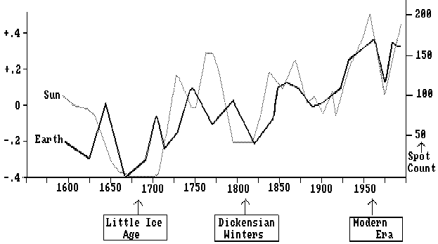
Fig.3 - Global Temperature and Solar Activity
1600-1990 AD Compared
(http://www.john-daly.com/solar.htm)
Reference to the climatic graph for
Europe of the last 1,000 years (fig. 4 shown
earlier) shows that the Maunder Minimum of solar activity during the
17th century occurred at exactly the same time as the Little Ice Age. Also to be noted is the high sunspot activity
associated with the warming Viking Era. The low level of solar activity in the
period 1800-1830 coincided with another cool climatic period dubbed the
"Dickensian Winters."
(http://www.newscientist.com/data/images/ns/cms/dn4321/dn4321-1_550.jpg)
Sun burning
hotter now than in past 11,000 years
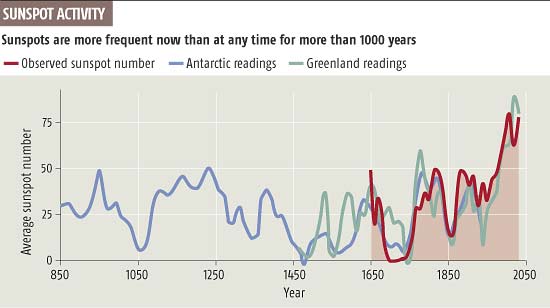
In the summer of 2004 Dr. Sami
Solanki, the director of the renowned Max Planck Institute for Solar System
Research in Gottingen, Germany reported that over the last century the number
of sunspots rose at the same time that the Earth’s climate became warmer. He
also stated that in looking at the past 1,150 years the Sun has never been as
active as it has been during the past 60 years. It is burning warmer, for
longer, than at any time during the past 11,000 years.
According to Christopher Monkton,
the entire 20th-century warming from all sources was below 2 watts.
The sun could have caused all of it.
Mars undergoing
global warming
We have also learned that the planet
Mars is also undergoing significant global warming, new data from the National
Aeronautics and Space Administration (NASA) show. “For three Mars summers in a
row, deposits of frozen carbon dioxide near Mars’ south pole have shrunk from
the previous year’s size, suggesting a climate change in progress. Because a
Martian year us approximately twice as long as an Earth tear, the shrinking of
the Martian polar ice cap has been going on for at least six Earth years.
According to Michael Malin, principal investigator for the Mars Orbiter Camera,
the polar ice cap is shrinking at “a prodigious rate.”
If indeed there has been warming, it
is clear the sun did it, not mankind nor greenhouse gases.
And what about
their third conclusion, sea levels rising and ice melting?
- Furthermore,
sea levels have risen four to eight inches since the beginning of the
industrial revolution. Since the 1970’s there has been a 10% to 15%
decrease in the Artic sea ice area, ice has become less thick, and there
have been significant decreases in the Earth’s snow cover.
When one gets into trying to measure global sea levels there are a number of highly complicated problems. According to John L. Daly’s article “Testing the Waters” (http://www.john-daly.com/ges/msl-rept.htm) “Mean Sea Leve' or MSL is defined as "the mean level of the water surface over a specific long series of measurements. No matter how long a period of data is averaged, the ideal true mean sea level is unattainable because changes are taking place over long and short time scales." Where sea level is measured at only one location, it is sometimes referred to as `Relative Sea Level' or RSL, since the measurement only specifies the height of the sea in relation to local landmarks.
Maybe the land
is rising or sinking
The article goes on to explain:
“If the land itself is rising or sinking, this would manifest itself as apparent sea level falls or rises, even if the actual level of the ocean had not changed. Until the advent of satellites, it was not possible to establish a truly global MSL. `Mean Sea Level' as a descriptive term is often used to mean either the MSL at one location (ie. RSL), or over an entire region.
“Global MSL is ultimately determined by the quantity of water in the oceans, the temperature of that water, the volume of ice stored on the Antarctic and Greenland ice sheets, the volume of ice stored in non-polar glaciers, and the quantity of water stored in natural and man-made inland catchments, lakes, and reservoirs.
Measuring the
sea levels – not so easy
“The standard instrument to determine MSL and the tidal extremes is a `tide gauge', which measures the height of the sea at regular intervals to record the passage of high and low tides and the harmonics unique to the location where the tide gauge is situated. Most such gauges are installed in the populated areas of the northern hemisphere, particularly in Europe and North America, there being relatively few such gauges with long records in the southern hemisphere.
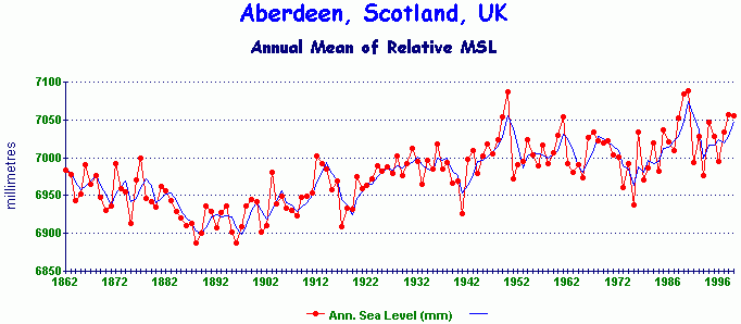
Fig.2 - Annual mean sea level at Aberdeen, Scotland, UK
“Fig.2 shows one of the oldest tide gauge records in the world, Aberdeen on the east coast of Scotland.
“The peak level at Aberdeen was around 1950 at 7087 mm and the lowest point around 1889 at 6887 mm. The overall sea level rise since 1862 is around 70 mm (ie. less than 3 inches), or an averaged annual rate of around +0.5 mm/yr, less than one third the global rate claimed by the IPCC.
“Can this Aberdeen record be taken at face value? Does it really reflect trends in global sea level? The short answer is we don't know. Tide gauges, like surface temperatures, are subject to several local errors which can distort the data. Just as temperature data is affected by urban heat islands, tide gauges located at major cities or ports are subject to urbanization also, mainly the tendency of large cities to subside due to the weight of the structures and the changes in the underground water table. The larger the city, the greater is the tendency toward subsidence (the pushing down of the land due to the weight of the city structures), a creeping effect over time which will manifest itself at a tide gauge as a creeping rise in relative sea level. Cities located on alluvial low lying coasts are the most affected.
Bangkok has been
sinking
“For example, Adelaide in South Australia is showing a strong sea level `rise' which is not evident at nearby smaller ports (Port Pirie, Port Lincoln, Victor Harbour). The Adelaide anomaly has since been found to be caused by long-term withdrawal of groundwater since European settlement, giving rise to local urban subsidence. Another bad case of subsidence exists in Bangkok, where the sea has risen by a meter in the last 30 years. The sea has not really risen, the land is merely sinking.
“A second subsidence error arises from the fact that most tide gauges are mounted on man-made structures such as piers and docks. Over many decades, these will undergo some subsidence unless they are built on bedrock.”
Post Glacial
Rebound
There is also an important phenomena in play in the European and North American regions which is known as Post Glacial Rebound, or PGR. Efforts to correct for this effect puts all European and North American tide gauge data in doubt.
During the last ice age, Europe was buried under several kilometers of ice. John Daly goes on to explain that, “The ice age ended about 10,500 years ago with a rapid melting of ice sheets over Europe and North America with a resulting rise in sea level. With the ice gone, the plasticity of the mantle below the solid crust of the earth is forcing the crust upwards now that the dead weight of the ice is no longer there. This process has been ongoing since the last ice age and will continue well into the future.
“PGR is underway all over Europe, North America, and east Asia, the continents most affected by these enormous ice sheets. It causes those regions which were weighed down by ice to uplift like Sweden, and causes peripheral regions around the margins of the former ice masses to subside as the continental crusts adjust and rebalance to the new weight redistribution.
“The North Atlantic is actually a huge basin semi-enclosed by continental land masses, with a 1,400 nautical mile gap between west Africa and South America to connect it to the remainder of the world's oceans. This may partly explain why long-term tide gauge records from within that basin are not always consistent with records from outside the basin. It is also unfortunate that all the really old tide gauge records extending back into the 19th century come from Europe, right in the center of the PGR zone. The later American ones are similarly affected.
“Local sea level rise in Venice has been occurring for hundreds of years, well before greenhouse gases became an issue, and is clearly of geological, not climatic, origin. Urban subsidence is also a major contributing factor in the case of Venice.”
As this ice melted additional water weight was moved around the globe causing a slow readjustment and rebalancing of continental crusts everywhere to compensate for the added weight of water that is still going on. In other tectonically active areas, such as the Pacific coast of North America, Japan and New Zealand, the tide gauge data from anywhere on these geologically active parts of this Pacific rim (the so-called `Ring of Fire') are profoundly compromised by tectonic activity making sea level measurement extremely difficult.
As a result it should at least be recognized that much of the data being analyzed is of very poor quality and badly distributed geographically.
To make some sense out of the mass of contradictory sea level data, a series of `de-glaciation' models were developed using calculations of earth mantle viscosity to determine how the mantle and overlying continental and seabed crusts would react to the melting of the great ice sheets at the end of the last ice age.
The ICE-3G Model
– Stockholm showed sea level dropping
One of the areas in the North Atlantic that had actually shown a rather large drop in sea level due to the PGR effect was Stockholm, Sweden, about 40cm over the past 110 years. (http://www.john-daly.com/ges/msl-rept.htm) As a result, “IPCC scientists made a massive correction to the data, turning a relative sea level fall into a mean sea level `rise'. This outcome resulted from adjusting the observed data with correction factors derived from the ICE-3G model developed by Peltier and Tushingham in 1991. This model purports to describe crustal movements of the continents and sea bed in the wake of the demise of the great ice sheets. The model depends on calculations about the plasticity of the earth's mantle upon which the crustal land masses `float'.
Changing the
data thru modeling
“ICE-3G is the most used model for correcting tide gauge data against PGR. It's creators, Peltier and Tushingham were among the first scientists to make the linkage between global sea level rise and the Greenhouse Effect, claiming in 1989 that sea levels were rising at a rate in excess of 1 mm/yr.
“The impression has been conveyed to the world's public, media, and policymakers, that the sea level rise of 18 cm in the past century is an observed quantity and therefore not open to much dispute. What is not widely known is that this quantity is largely the product of modeling, not observation, and thus very much open to dispute, especially as sea level data in many parts of the world fails to live up to the IPCC claims.
“The ICE-3G model is a global theoretical treatment describing how the ice masses melted and disintegrated at the end of the last ice age and the consequent readjustments made by the crust under pressure from the lithosphere below. However, the model does have some inherent weaknesses.
“What is very clear is that the ICE-3G global de-glaciation model is really a North Atlantic-Arctic model, the accuracy of which must deteriorate as distance increases from the ancient ice sheets, particularly in regions outside the North Atlantic basin. For the rest of the world's oceans and crust, this model may have little relevance at all, especially given the paucity of RSL sites in the Pacific and southern hemisphere oceans against which to calibrate the model.
“ICE-3G model does not and cannot correct for tectonics such as exists on the `Ring of Fire' in the Pacific. It does not and cannot correct for local urban subsidence such as exists in Adelaide, Venice and Bangkok. It cannot correct for subsidence of man-structures upon which tide gauges are mounted. With or without the ICE-3G model, all these other local errors still exist and make global estimates of sea level change very difficult to validate.
“Whatever degree of confidence is placed in this model, its use in determining past global sea level changes means that the IPCC estimate of +18 cm sea level rise over the last 100 years cannot be regarded as an observed value, but as a largely modeled value with a high error margin due to local distortions.
“Once we depart from the northern hemisphere tide gauges, particularly those from within the North Atlantic basin, and those compromised by local tectonic activity, a very different picture emerges about sea levels. The following graphs are either directly from the Permanent Service for Mean Sea, or drafted from data originating from the same source.
“Here is the monthly MSL from Montevideo in Uruguay, with a 12-month smoothing added –
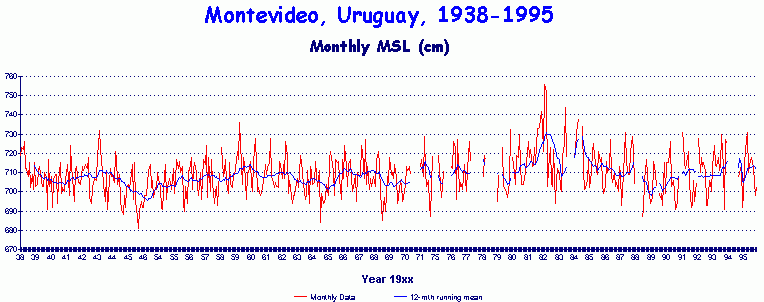
Fig.9
- Monthly and smoothed relative MSL from Montevideo, Uruguay
“The record has several short breaks, and with the exception of an anomalous peak in sea levels during the early 1980s, there appears to be little change at all.
“Crossing the South Atlantic east from Montevideo, we arrive at East London, South Africa.
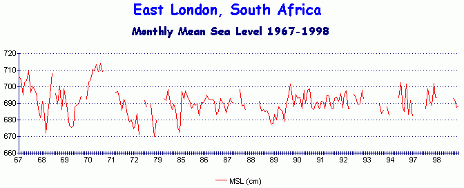
Fig.10 - Monthly MSL from East London, South Africa, 1967 to 1998
“This record is also broken in parts, but other South African tide gauges are even worse, a common problem all over the world. There we see a peak variation in sea level of around 40 cm during the early 1970s although there is no significant long-term trend.
“Crossing the Indian Ocean, we arrive at Vishakhapatnam on the east coast of India.
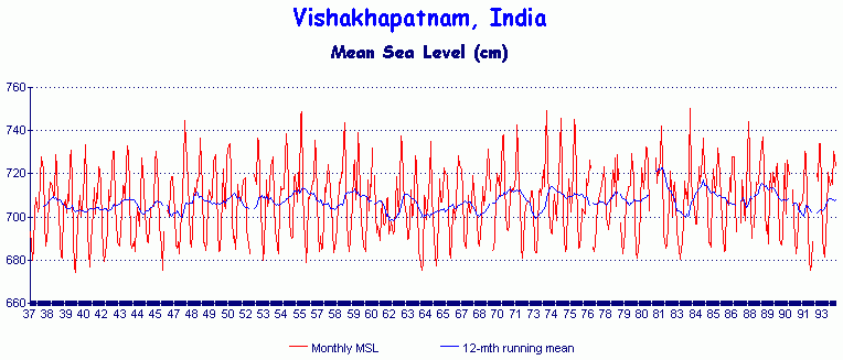
Fig.11 - Monthly MSL from Vishakhapatnam, India
No overall sea
level rise here
“This is a good quality record overall with only a few brief breaks. There is little overall change over a 57-year record, sufficient time to have resulted in a sea level rise of over 10 cm if the IPCC claim were correct.
“The Australian National Tidal Facility (NTF) at Flinders University in Adelaide published a `Mean Sea Level Survey' in 1998 to establish sea level trends around the Australian coast from tide gauges having more than 23 years of hourly data in their archive. This survey was particularly relevant for global application since Australia is tectonically stable and much less affected by PGR than either Europe, Asia or North America. Since nearly two-thirds of the world's total oceanic area is in the southern hemisphere, Australia is best placed to monitor southern hemisphere trends and probably best represents the true MSL globally. Also, the Australian coast adjoins the Indian, Pacific, and Southern Oceans, making its data indicative of sea levels in three oceans, not just one.
“The NTF identified the following tide gauges as meeting the criteria, and calculated the annual sea level change for each (in mm/yr). Sea level rises are shown in red or +, falls in blue or -. The stations run anti-clockwise around the Australian continent, starting with Darwin in the Northern Territory. Compare these results against the claimed IPCC rate of +1.8 mm/yr.
|
Location |
Years of data |
Est. trend |
|
Darwin, NT |
34.9 |
-0.02 |
“Eleven of the 27 stations recorded a sea level fall, while the mean rate of sea level rise for all the stations combined is only +0.3 mm/yr, with an average record length of 36.4 years. This is only one sixth of the IPCC figure. There was also no obvious geographical pattern of falls versus rises as both were distributed along all parts of the coast.
“The world's public was given the clear impression that the claimed 18 cm sea level rise for the 20th century was an observed quantity. It is now clear that this is not the case. The 18 cm figure arrived at is the product of combining data from tide gauges with the output of the ICE-3G de-glaciation model.
“Thus, the claimed 18 cm sea level rise is a model construct, not an observed value at all.
“Worse still, the model which has created it is primarily focused on the North Atlantic basin which shows relative sea level trends quite unlike those observed outside that region. Thus, global estimates cannot be inferred with any confidence from modeled trends which mainly affect only that basin.
“In the remaining oceans of the world, there is a clear lack of evidence of sea level rise during the 20th century, particularly around the Australian coast which is representative of three oceans, with a good quality record of tide gauge data. The rise recorded there is an insignificant 1.6 cm for the whole century, or just over half an inch.
No warming, no
sea level rise
“Finally, it should not be forgotten that whatever is said about sea levels is entirely dependent upon how global climate responds to greenhouse gases, whether the planet will warm significantly or not. Sea level rise is contingent on atmospheric warming.
“The record of atmospheric temperature as recorded by satellites since 1979 has shown no significant warming in spite of numerous model predictions to the contrary.”
What about the
ice thickness?
Once again the problem boil down to measurements, assumptions and models, especially so since no noticeable warming has been taking place in the Artic or Antarctic.
“The Antarctic continent shows no overall warming since reliable records began there in 1957 as suggested by this temperature record from the South Pole itself. Indeed, the South Pole appears to have cooled, not warmed.
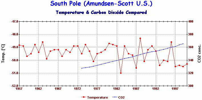
Fig.2 - Annual Mean Temperature at the Amundsen-Scott Base (U.S.) at the South Pole [9]
“There has been
localised warming in the 2% of the continent represented by the Antarctic
Peninsula, and cooling over most of the remaining 98%. In the Arctic,
there are regions which show warming (e.g. northern Alaska and north-western
Canada), and other regions which show either no warming or even cooling
(north-eastern Canada, Russian Arctic, Greenland and the Arctic Rim,
comparative graphs below).

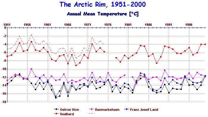
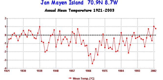
Fig.3 - Annual Mean Temperature at 4 Arctic Rim stations [9]
Note: The raw data from Svalbard (Spitzbergen) was from two separate stations during two distinct periods. They cannot be merged together without adjustment as they had different long-term mean temperatures. The red dotted line shows the original early data from Svalbard. To merge them, both were compared with Danmarkshavn, and the early Svalbard record then adjusted with a uniform correction to make the average difference between Svalbard and Danmarkshavn equal for both periods.
“Taken as a whole, there is no significant Arctic-wide warming evident in recent decades. According to many station records there, the warmest period was around 1940, not the `warm' 1990s.” (http://www.john-daly.com/polar/arctic.htm)
In spite of this, the ICC journalists and the media have insisted on fashioning a specter of tons of ice getting thinner and rapidly melting. So let’s review briefly this scenario.
What ice was measured and how was it done?
In the various studies discussing the “thinning’ of the Arctic sea-ice, it is important to show exactly what was measured and how it was measured. In the highly publicized study made by Rothrock and Maykuk in 1999 “Thinning of the Arctic Sea-Ice Cover,” the study measured ‘draft’ instead of the actual thickness of the ice. This measures the depth of the ice below sea level, and therefore eliminates any ice thickness above sea level.
According to Daly’s article, “The ice draft was measured from submarines using sonar equipment, thus allowing fairly rapid transits of sections of the Arctic Ocean, averaging the draft data measured. Arctic ice varies in depth from 1 metre to 5 metres, so that the underside of the ice will have an undulating contour.
“The ice draft was measured during two distinct periods. The first phase occurred between 1958 and 1976, where several submarine cruises were made. These were -
|
USS Nautilus |
1958 (August) |
“The second phase, and the one upon which this
study was based was conducted between 1993 and 1997 using US submarines USS Pargo
(1993), USS Pogy (1996), and USS Archerfish (1997), all of them
making sweeps of the Arctic ice during the month of September.
“After averaging of the ice draft data between the two periods, the authors (of the study) concluded that ‘In summary, ice draft in the 1990s is over a meter thinner than two to four decades earlier. The mean draft has decreased from over 3 metres to under 2 metres’”.
“It is little wonder the greenhouse industry seized upon such a dramatic conclusion and made a media circus out of it. But were these conclusions sound? Did the ice thinning, if indeed it was such, represent global warming in action, or were other factors in play?
Data Corrections
“The ice thickness data was not simply a case of taking a set of numbers and averaging them. The authors subjected them to extensive corrections. The first correction was to normalize all the data to September. Ice thickness varies with the seasons and the first phase measurements were taken in different months, which meant like was not being compared with like.
“So the authors used a model. Are the data corrections correct'? They are only as good as the assumptions inherent in the model.
“There was also a second set of corrections made, this time on the data from the USS Nautilus (1958) and the HMS Sovereign (1976), the two `outlier' data sources. This was prompted by the fact that the sonar equipment used in the other submarines in the first phase and all those in the second phase were all `narrowbeam' sonars. But the Nautilus and the Sovereign used `widebeam' sonars. To compensate for this, the authors made additional corrections to the data from these two submarines by multiplying everything by 0.84. But was this an adequate correction for such a significant equipment difference?
“With narrowbeam sonar, the beam is able to readily pick out ridges and troughs in the underside of the ice, so that if the ice has an undulating subsurface varying between, say, 2 metres and 4 metres, the sonar will `see' these undulations and the computer can make a reasonable average to, say, 3 metres.
“Not so with `widebeam' sonar. With a wide beam,
the sonar cannot discriminate between the peaks and troughs in the ice, and
instead returns an echo which only records the thickness at the peaks, so that
any statistical averaging will come up with 4 metres (ie. the ice thickness at the peaks) but not
recording the troughs or crevices in the way a narrow
beam would do. In the example just given, a correction of 0.75 would be needed,
not 0.84. If the beamwidth correction is inadequate, the Nautilus and Sovereign
data will give the impression of observing thicker ice than in fact existed at
the time. This would then compare unfavourably with the ice more accurately
measured by narrow beam sonars in the 1990s.
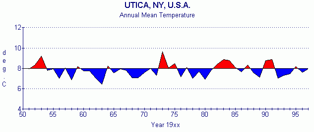
What
should be the baseline starting point?
In addition, one important fact that is never
mentioned is that the 1960’s were a very cold period of time in the Arctic, as
can be shown from the chart below of just one of the reporting stations in the
area. Other stations –Spitzbergen, Vise, and others - all show the same
conditions.
In other words, it is more likely that it was the 1960’s that were abnormally cold, and it is the present that is normal.
Moreover, “massive nuclear testing, particularly by the old USSR at
their test site at Novaya Zemlya (a large island within the Arctic Ocean)
during the 1950s and 1960s suggests the exceptional cold of those years was not
natural at all, but artificial, caused by dust and aerosols blasted by these
tests into the Arctic stratosphere. It is little wonder therefore that these
two decades show up in the Arctic station records as the coldest of all.
“This puts the
comparative ice mass data between these years and the present in an entirely
new light. The submarine study is effectively making an adverse comparison
between present conditions and those which existed during an artificially cold
period in the Arctic, a mini nuclear winter.
Another
‘proxy’ model to get the ice thickness
“This is yet another example of a `proxy' study (ie, a study where `warming' is measured by proxy indicators other than direct measurement such as with a thermometer), which uses models, `adjusted' observational data, esoteric statistics, and false interpretation of data from atypical start and end dates. It was grossly unsound was to interpret this as an abnormal event, to treat the anomalously cold period of the 1960s as being the `normal' baseline condition, and to thus compare the present unfavourably with it.
Total area of
ice cover
“The only really useful indicator of Arctic ice is that of extent (ie. the total area of ice cover), as this can be determined easily by satellite survey. During the current northern winter (1999-2000), sea ice extent has been even greater than in previous years, particularly around Alaska. ((http://www.john-daly.com/polar/arctic.htm)
“This graph shows Arctic sea ice extent, based on satellite observation since 1973.
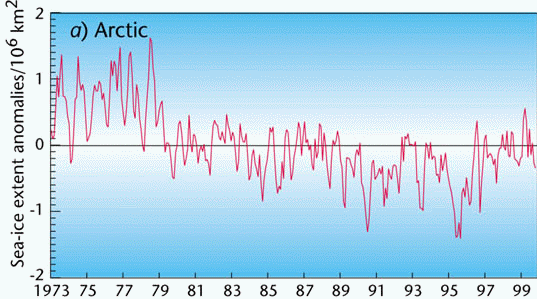
Fig.10 - Arctic sea ice extent 1973-1999 [10]
The total area of the Arctic Ocean is about 14 million sq. km. The above graph shows a significant shrinkage of ice extent during 1979 at the end of the Arctic cold period, amounting to almost 1 million sq. km., or 7% of the total. Since 1979, the ice area has largely stabilized, reaching a brief minimum around 1995, and increasing again since then. Put simply, the ice area today is scarcely different to what it was in 1979. This is consistent with observations that the Arctic atmosphere has not warmed since 1979. Had it warmed through the 1980s and 1990s, the ice area would have continued to shrink as increasing air temperature would have failed to re-freeze the ocean surface.” (http://www.john-daly.com/polar/arctic.htm)
Conclusions regarding the ‘glum prognosis’
As for the global warming hysteria that seems to lead to the “glum prognosis” for the future, I fail to see any such glum prognosis on the basis of the evidence. It just isn’t there.
Each of you, of course, will have to draw your own conclusions from the data presented here and from wherever else you choose to find it. Given the emotional climate of the discussions, it is important, however, that you try to determine the motivations of some of those presenting the data. Do not be fooled by those who would claim that they are obviously neutral in their presentations and that other presentations are somehow ‘industry driven.’
I have checked out several of those who were involved in authoring the reports issued by the United Nations’ Intergovernmental Panel for Climate Change – the IPCC. Though it its beyond the scope of this analysis, I found it most interesting that several had established substantial companies who were now specializing in providing ‘climate change mitigation’ information as highly paid consultants to state governments and to corporations who were now being forced to deal with those problems that these same individuals had ‘discovered’ and were portraying as being the absolute truth. Pretty clever, it seems to me. Kind of like the oldest profession whereby she sells it, you buy it, and she keeps it.
Remember that H.L. Mencken once observed, “The whole aim of practical politics is to keep the populace alarmed (and hence clamorous to be led to safety) by menacing it with an endless series of hobgoblins, all of them imaginary.”
Therefore, beware of photographs and images inserted into a predetermined hysteria hype. If you were to see the recent photos of the 14 foot snow falls in upstate New York, and I told you that global cooling was going to wipe us out, you might say I was nuts today (but maybe not, back in 1975). But if you see the snowcaps on Mt. Kilimanjaro shrinking in today’s political context, you have no problem believing that global warming must exist.
However, “not to be confused with
the `snows' of Kilimanjaro (which still come
and go with the weather), the ice is actually an ice cap on top of the
5,900 metre mountain in northern Tanzania close to the Equator. That ice cap
has been steadily melting away all through the 20th century and is expected to
be fully melted away within the next 20 years.
”Why has it been melting so relentlessly? Satellites have been measuring
temperature since 1979 in the free troposphere between 1,000 and 8,000 metres
altitude, and they show no tropospheric warming in that area. None.
”Kilimanjaro is above most of the weather and is thus exposed to the equatorial
sun, a sun which has been hotter during the 20th century than at any time since
the medieval period. That would be a sufficient explanation in itself for the
depletion of the ice cap.
”However, a finding published by Nature,
points to de-forestation on the slopes of Kilimanjaro as being the main
culprit. With forests present, the natural updraft from the slopes
carries moist air to the summit and helps reinforce and sustain the ice cap.
Without those forests, the updrafts are dry and fail to replenish the ravages
of the sun on the summit ice cap. That too is a sufficient explanation.
What happens on Kilimanjaro will also be happening on countless mountains all
over the world where forests on lower slopes have been replaced by open
pasture.” ( http://www.john-daly.com/press/press-03c.htm#evidence)
Blaming it all on `global warming'
is not the answer. Listen to Mencken.
Likewise with pictures of glaciers
breaking off. It happens all the time.
It has to, just like avalanches do.
Climate change – note, it is no longer being called ‘global warming’ - has now become a multi-billion dollar industry that is being driven mostly by unsubstantiated facts and simple hypothetical models. Lobbying for environmental causes alone consumes some $1.5 billion per year, according to Myron Ebell who works for the Competitive Enterprise Institute in Washington, DC.
The unfortunate part of all this is that we do have a number of critical problems that we should be addressing more strongly. Just one is that, of the world’s six billion people, four and one half billion have no electricity or running water. Another is the fact that many nations around the globe have few hospitals and only limited medical care. It doesn’t take hypothetical computer models, most of which can’t even predict the weather two weeks out, to verify many of these real situations.
Instead of running around beating our chests about some problem that is practically non-existent and which, if it were existent, we could do little about, we would be far better off trying simply to alleviate some of the real suffering that does exist in today’s world.
Remember: Gravity – it’s not consensus. It’s the law.
David Morgan is Editor-at-Large of the Tribune
Papers.